Are you considering building a website for your association?
Or maybe you already have one, but it needs a redesign?
Websites for associations have certain requirements that other websites might not.
After all, you need to make it attractive to potential members, as well as continuing to provide value to people who have already joined you.
Plus, considering all the events you run and all the resources you provide, there’s a lot of ground you have to cover.
That’s why it’s so important to get it right — and why we’re sharing some of the best association websites to help inspire you!
In this post, we’ll cover:
- What Your Association Website Needs to Include
- 10 Amazing Association Websites Built Using WildApricot
- How to Create Your Own Association Website in 3 Easy Steps
And if you just want to get your association’s website off the ground, we’d recommend starting a free 60-day trial of WildApricot.
The website builder feature in WildApricot has tons of templates perfect for any sort of association, and they’re completely customizable using drag-and-drop building blocks.
WildApricot is the #1 association management software on the market, used by over 10,000 associations around the US and the rest of the world. You can start your free trial today and have your whole website built in an afternoon.
What Your Association Website Needs to Include
Before we look at our favorite association websites, it’s worth mentioning that most of them have a number of the same features or sections — this is because these sections are must-haves for your association.
Of course, your association is unique and so is the value you offer to your members. This means that there will be sections that are specific to your organization that aren’t listed here. However, there are some sections and requirements that are crucial for all associations, such as:
- About Us: Adding your mission statement as well as your purpose can help attract new members to your association. You might also want to include a section about your team so that you can share who’s at the helm.
- Join Us: This is where you can list membership levels and benefits and provide a form that site visitors can use to join your club.
- Members’ Only Area: Your site can be visible to the public, but if you want to offer content that’s exclusive to members like a member directory, you can have them log in to view it.
- Events: Your association likely hosts many events, whether virtual or in-person – be sure to keep your members up to date on what events are coming up and what they should expect, as well as what events have already happened and their outcomes or takeaways.
- Mobile-Optimized: More and more people use their mobile devices to browse the web, especially when they’re on the go. Make sure your website is mobile optimized to offer the best possible user experience.
Now without further ado, let’s look at 10 amazing examples of association websites and some of the unique features we liked about them.
10 Amazing Association Websites Built Using WildApricot
1. Upper Midwest Translators and Interpreters Association

What we liked:
- The UMTIA provides sections of resources for different types of interpreters, showing that they understand their market and aren’t taking a one-size-fits-all approach. This makes visitors more likely to find what they’re looking for and see value in their website, thus becoming more likely to convert into members.
- They have a section called “What Members Say”, which provides great social proof for the value of their services and is something that we’d recommend all professional association websites include.
2. Arizona Evaluation Network
What we liked:
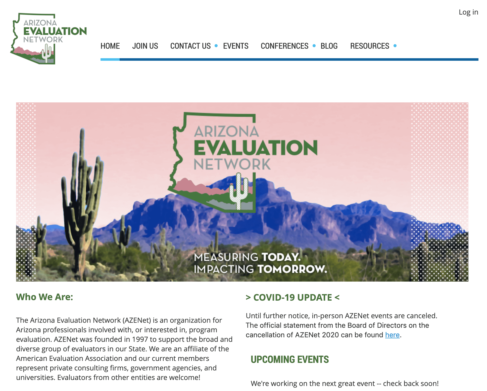
- The graphic on the homepage of this website is particularly eye-catching — they did a great job tying together the colour scheme throughout their website with their logo and remaining consistent with their branding.
- They also provide links to their social media accounts on the homepage, making it easy for visitors to find out more about them and connect with them wherever is most convenient for them.
3. Pikes Peak Pickleball Association
What we liked:
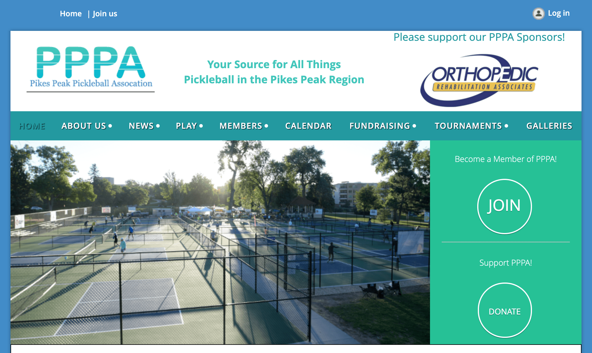
- The buttons for Join and Donate are very prominent on the PPPA homepage, making it easy for visitors to take the desired action.
- They also include a rotating list of their sponsor logos at the top of the page, providing a great way for them to be recognized.
4. National Career Development Association

What we liked:
- The NCDA has a section called “Advocacy” where they highlight their recent work in the political sphere and share advice with their members on how to do the same. This is a great way to show their impact to potential members and casual visitors alike, especially since it’s frequently updated.
- One of their most useful resources, the career assistance search, is included right in the middle of their homepage banner, making it easy to access. This is a great member perk as well as being valuable to visitors who are in need of their services.
5. The Society for Academic Continuing Medical Education

What we liked:
- SACME asks visitors to subscribe to their mailing list directly from their header, which is an easy way to attract new potential members — if you continue to provide valuable information to your email list, visitors are more likely to be converted to membership.
- They provide information about Grants and Funding at the bottom of their homepage, which is one of the main member benefits they offer. Providing this information upfront provides an additional incentive for potential members.
6. Association of Leadership Educators

What we liked:
- ALE has a Members’ Only section on their website, which allows them to keep high-value content such as their Member Directory and Forum private and advertise them as perks of becoming a member. Plus, because it’s promoted as one of the three main areas in their header and “Join ALE” is also prominently displayed, new visitors are immediately prompted to wonder if membership is right for them.
- They also have a Job Board, which gives them an additional source of revenue as well as an additional member perk (since job postings are less expensive for members)
7. Association of Professional Humane Educators

What we liked:
- The “Give to APHE” tab provides two options: “Gift of Money” and “Gift of Time”. This is a great way to showcase both ways that they’re looking for assistance, and provide options for visitors who may have one and not the other.
- They also include a member spotlight on their homepage, which is a great way to make members feel valued and help build a sense of community.
8. Professional Women’s Association Rome

What we liked:
- The PWA mission statement is clearly stated on their homepage along with an embedded “about us” video. This allows potential members to quickly decide if it’s the right association for them.
- They provide an abundance of resources open to the public, from newsletters and conferences to upcoming workshops and networking events.
9. Arizona Airports Association
What we liked:
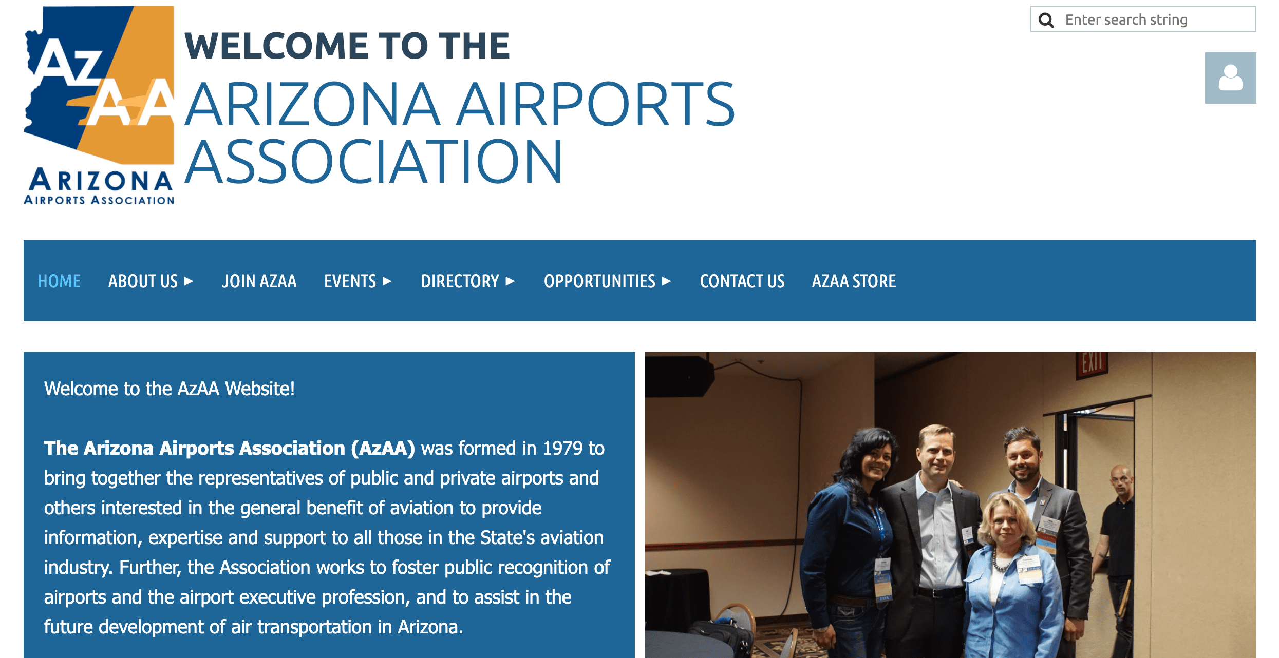
- The AzAA website includes an online store for their association, which allows members to share their love for your association by purchasing something with your logo (and gives you an additional fundraising source).
- Their homepage lists out all of their sponsors, which is a great benefit to provide when you’re looking to get additional sponsorships.
10. Clarksburg Wine Growers and Vintners Association

What we liked:
- The slider on the Clarksburg Wine Growers and Vintners Association homepage has one image that says “Wineries” and another that says “Growers”, immediately making their two primary audiences clear.
- They also promote their members’ wines with their “Wine Special” tab — even if your members don’t sell physical products, having a tab that showcases them and promotes what they’re working on is a great potential perk.
How to Create Your Own Association Website in 3 Easy Steps
Association website design doesn’t have to be complicated. If you’d like to create your own website right now, I recommend starting a free trial of WildApricot.
Here’s how to set up everything you need in just an afternoon:
1. Start a Free Trial of WildApricot: click here.
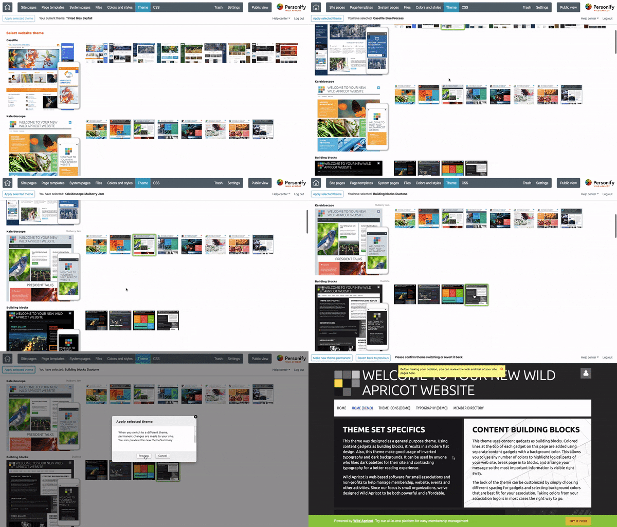
2. Select a website template from one of the professionally designed options:
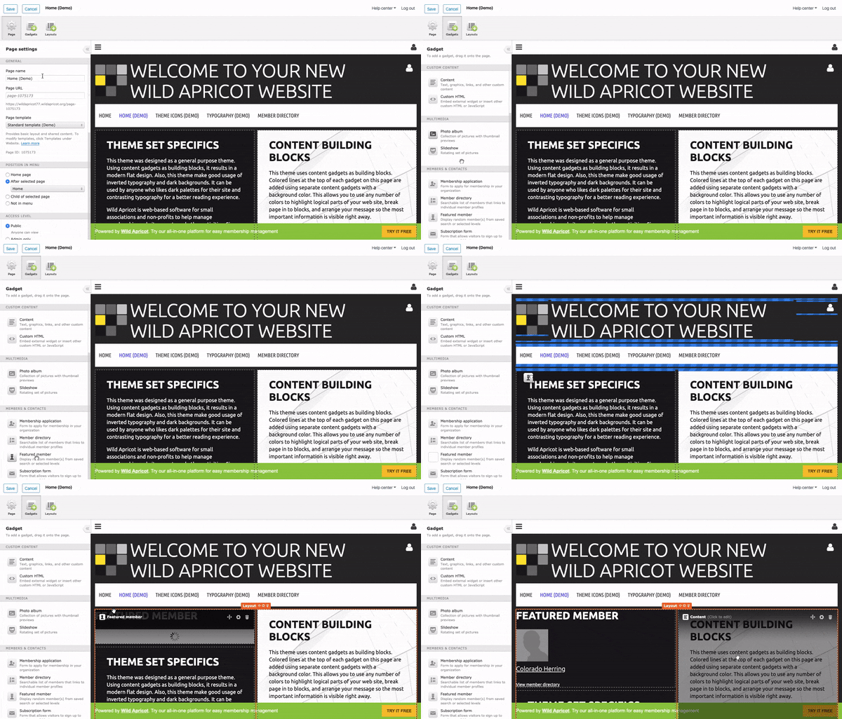
3. Edit the template using the easy drag-and-drop builder to fit your association’s needs:
And that’s it.
Best of luck with your association’s website!


![Best Membership Website Examples in 2026 [+ 12 Design Tips]](https://b2993016.smushcdn.com/2993016/wp-content/uploads/2023/10/Main-Blog-Thumbnails-2026-03-17T143806.792-1024x717.png?lossy=1&strip=1&webp=1)


